In Need of Your Opinion
Which ad below would entice you to click?
Take a look at the ads. And in the “COMMENT” section below, TYPE THE NUMBER of your favorite ad.
Thank you SO much. Your opinion is very much appreciated.
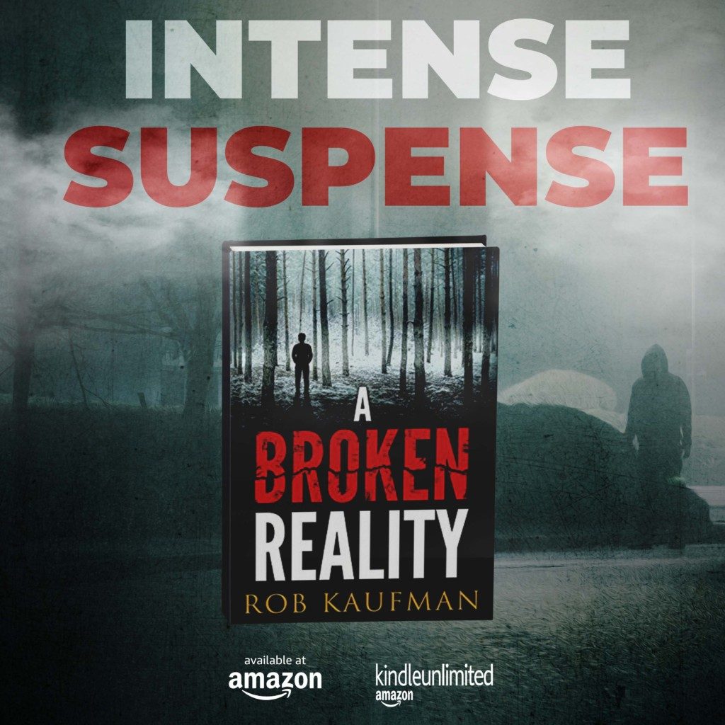
AD NUMBER 1

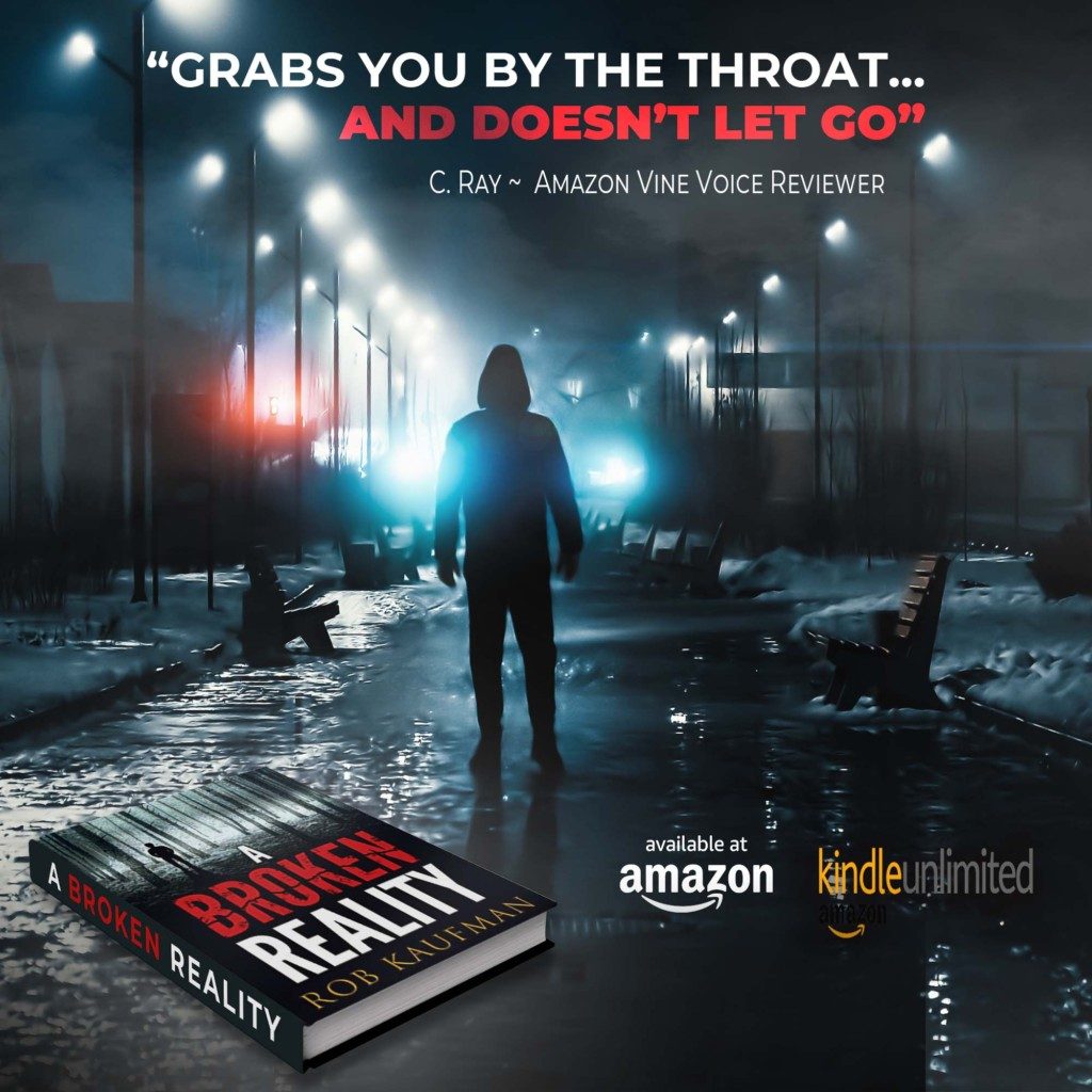
AD NUMBER 2

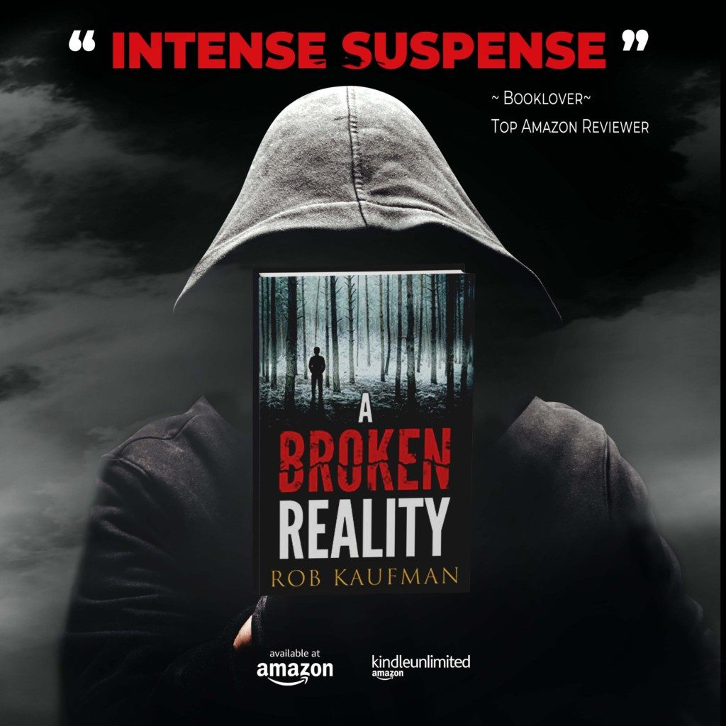
AD NUMBER 3

Hello author Rob, this message relates to voting on your book Altered. I voted the highest a 10:on the cover because it is AWESOME! I get lost in that cover! I was seeing one person, then another person and then I saw the brokenness of them both in the picture. Use this cover!! This book is going awe people!
Thanks, Debra! I like it too!!
Thank you!
Ad #1
Number 1
Thanks, Debra!
Number 1
Thank you, Stacey!
I previously voted 2, but have just realised I’ve already read this book and number 1 is far more suited to the story than 2. so if not too late I’ll change my vote to 1 🙂
Vote changed! Thank you!
I like the looks of # 1 the best. I like the quote on # 2 but there’s too much in the picture which doesn’t make the cover of the book stand out. I found # 3 a little too bland.
Thank you, Linda.
Appreciate the input!
I like the picture of # 3, and the wording in #2.
Thanks, Debbie!
I really like # 1. It caught my eye immediately. Good job.
Thanks, Sylvia!
#2
Thanks, Rob!
I like #2 the best; however, #1 looks the most cohesive with the woods on front of the cover.
Thanks, Deanna!
I prefer #1.
Thanks, Kathy!
Maybe #2
Thanks, Linda… I’ll take the “maybe” into consideration. 🙂
I like the ad number 1 the best because it shows the book. Then I like ad 3 next. Same reason, I like the cover of the book embedded in to the ad.
Thanks, Karen.
I’ll be “testing” them, so we’ll see which one performs the best!
#2
Thanks, Barbara!
I prefer ad number 1.
Thanks, Pascal!
#2. It really grabbed my attention. I imagine the book will match the pic.
Thanks, Didi!
The book DOES match the pic… that’s what the reviews say. 🙂
No 1.
Thanks, Karen!
Number 1
Thanks, Karen!!
#2.
Thanks, Gretta!
1st choice = #3
2nd choice #1
Thanks, Lori!
No. 2
My pick because it’s something different. Unusual, makes you look for what you might be missing.
Thanks, Hazel!
2 seems to make me want to buy the book.
It looks the most professional also,
Thanks, Jerry!
Number 1 is the creepiest.
Thanks, Linda!
I like # 3 the best.
Thanks, Kay!
like #3 best
Thanks, Terri!
Number 2 is more striking and shows chinos.
Thanks, Lucy.
“Chinos?” – just not sure what that meant and why it’s a good thing. 🙂
Number 1 matches the book cover. That’s the one I like.
Number 2 doesn’t go with the description of the settings in the book. Number 3 would have been better if the book was in front of the person’s chest with the face a hazy, gray area.
Whichever one you use, the book was an awesome read.
Thanks, Lolah.
I appreciate the recommendations – and the call out of the “awesome read”!
My favorite is #3
Thanks, Darcy!
No: 3
Thanks, Maureen!
1 stands out the most for because of the background. I love intense thrillers!
Thanks, Lisa!
#1 I don’t care what anyone (well known or not) has to say about a book
Thanks, Nicki.
That’s good to know.
Rob
1 stands out the most for me because of the creepiness; fits the title best
Thank you for this!
I like the strap line on ad 2 but the visuals of ad 3.
Thank you!
#2….I would at least check this out….it got my attention…
Thanks, Dee!
Definitely #2
Thanks, Terry!
AD Number 3
Thanks, Celine!
I like #2
Thanks, Kevin!
No 3, grabs my attention
Thanks, Christine!
Number 1, the background highlights the intense suspence.
Thanks, Cynthia!
Like #1 or #3. I see you are now on Litsy, yay! Now post a book and add followers (I’ll stop bugging you). I just recently reviewed One Last Lie for you on there. I have a lot of followers and I am seriously a nobody! People love authors on there (you have 4 followers already). I have thousands and I’m only a reader! Waiting patiently for your next one!
Thanks so much, Anne. How am I on Litsy? You might’ve told me about it and I joined (I listen to everything you tell me to do!).
I’m going to go back and check it out. I am on the final chapter of my latest. Will write the Epilogue then get to editor.
YOU are on my Advanced Reader Copy list, so you, of course, get first dibs. 🙂
Thank you for posting the review on Litsy. Will check it out as soon as I’m done typing.
Rob
#2
I want to immediately open the book and start reading until the end.
Thanks, Jackie!
#3!!!!
Thanks, Yamil!
I’m choosing # 3. (with #2 as my second choice).
Thanks, Glenda!
I like #1 Its a little suttle but every fears what is lurking and watching from the wood s
And we I like #2 chaotic but this day and age many minds are this that.
I like both these covers
Good luck pickin
Thanks, Darlene!
Number 3 attracts my attention the most.
Thanks, Linda!
I like #1 but with a couple of changes lol
1) I like the graphic of the book as the main focus but I like the “grabs you by the throat” quote better than the “intense suspense” one
2) I think the word “kindle” should be in its orange color that is part of its actual logo (like you have it in ad #2
Thanks, Mark.
Great recommendations. I will be doing a lot of testing!
Rob
1 or 3, don’t like 2 because the book at that angle seems wrong
Thanks, Dee!
I’m going to check that book angle while I’m at it! 🙂
None would make me want to buy. I think you might have used instead:
life – and reality – are forever changed for two loving families
Thanks, Reed.
I’d probably need a different visual for that.
Appreciate the input!
I like #2 the best
Thanks, Oralee!
#3, is give a suggestion of mystery and suspense
#1 is too generic, looks cheap.
#2 is too busy you barely notice actual book
Thanks, JoAnn!
I prefer No. 1 – simple, clear, uncluttered
Thanks, Mel!
Number 1 it’s got that suspense mystery intriguing look about it.. with the slightly misty look with a man hiding behind a rock. What’s he hiding from.
Number 2 very messy cover. Maybe it’s supposed to look like that but I would think if the covers messy what’s the look like. Mo i will by pass on number 2
Number 3 says thug putting the book we’re his face should be it being surrounded by a black hoodie says thuggish doesn’t give me any positive vibes…. So I would by pass on…. NUMBER 1 SAYS EVERYTHING I WANT IT TO SAY SUSPENSE. MYSTERY… INTRIGUING
Thanks so much, Marj!
2 is the most eyecatching
Thanks, Irene!
2
Thanks, Pasi!
#3
Thanks, Debra!
Number 1 or 3. Great covers
Thanks, Krisk!
I think either 2 or 3!
Thanks, Emily!
Close call between 2 & 3 but end up voting for 2.
Thanks, Susan!
1
Thanks, Collette!
I like Number 2 the most
Thanks, Billie!
I like 3.
Thanks, Sheri!
2
Thanks, Madeleine!
2
Thanks, Mandy!
I LOVE 1…brought back chilling deceptive memories. Like 3. I don’t like 2…it makes the story sound slasher…and it’s not. The word throat is off putting to me. But the hazy effect of 1 and 3 is hauntingly accurate. (My 2 cents!)
Thanks so much, Ruth.
Great feedback from someone who knows the characters so well.
2
Thanks, Judy!
#2-the lights drew my attention first
Thanks, Shari!
I’ve been hearing that a lot. 🙂
2
Thanks, Debbie!
#1
Thanks, Carolyn
2
Thank you!
#3 gets my vote. Top Amazon Reviewer is someone I would believe.
#1 – I don’t like the “Intense Suspense”
#2 – I’m not sure what a “Voice Reviewer” is. I don’t like audiobooks.
Hope this helps.
Thanks, Marj. Definitely helps.
A VINE VOICE reviewer is someone Amazon chooses to read books and review them – meaning they read a LOT.
Definitely ad 2 as this catches the eye more
Thanks, Tina!
2
Thanks, Laurie!
2
Thanks, Jackie!
I like ad 3 if that helps.
Thanks, Susan!
Number 2
Thanks, Sheila!
#2
Thanks, Scott!
I like all of them and am torn which to choose. I must say the #3 is the scariest one and since the ad says “Intense Suspense” I’m choosing it.
#1 is clean and classy though.
Thanks, Donna!
I’m torn also, which is why I asked for opinions. 🙂
So subjective.
Torn between #2 and #3 but if I had to pick one it would be #2.
#2
Thanks, Terry!
Number 2.
I like the atmospheric ‘background.
Thanks, Heather!
1
Thanks, Nancy!
Definitely # 1!,
Thanks, Patricia!
2
Thanks, Randi!
3
Thanks, Larry!
Most attracted to number 2
Thanks, John!
I like No1. The visual of the person in the shadow adds to the person in the trees.
There is too much visuals in No2. I was not paying any attention to the book but rather my eyes were looking around the background.
I found No3 to be uninteresting so If I didn’t know you as a really excellent author already I probably wouldn’t bother to explore the book further.
That’s good info to know!
Thanks, Sue.